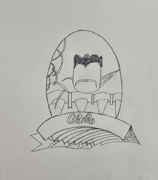
Chilo Craft Beer: Brand Identification and Packaging
The brief was about creating the two sectors that were important to us in the brief, that is, brand identification and packaging design. This was a process with different styles used to make the type of style relatable based on the type of story style I was showing. I chose craft beer as the best choice for what I wanted to design. craft beer
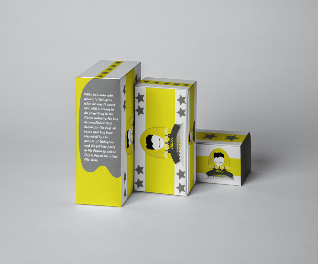
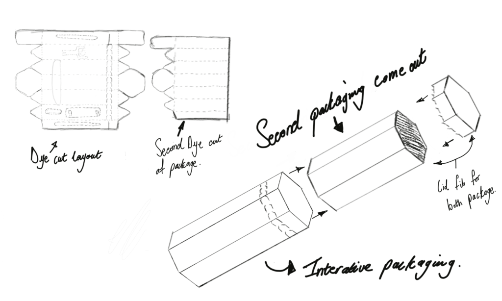
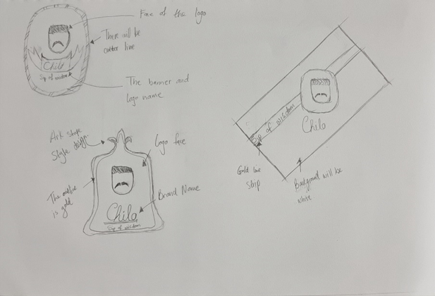
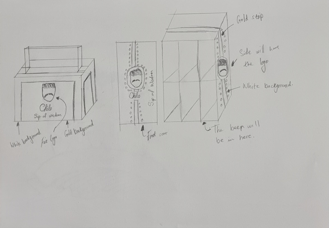
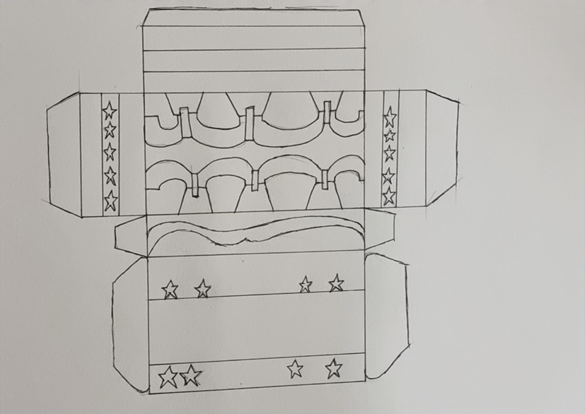
This is the box container in which the beer bottle will be placed. Because of this, the pieces have the appearance and feel of Upington, Northern Cape, and provide the customer with the background of the Chilo persona.

This is the beer bottle; the personalised Chilo glass would be included in the order as well.
The Processes
Other merchandise of the brand
Puzzle Monster Packaging
The goal of this brief is to discover novel methods for producing packaging that won’t damage the environment and for encouraging consumers to recycle the packaging they use, which will allow businesses to recycle as well as avoid wasting more materials that might hurt the environment. The answer is to design a package out of cardboard boxes so that the packaging can be recycled. The package’s objective is to establish a sweet industry for the youngsters who are its target market.
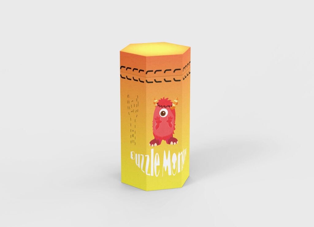
In addition to being the group leader of the puzzle monsters, Red is a powerful person who enjoys making kids happy.
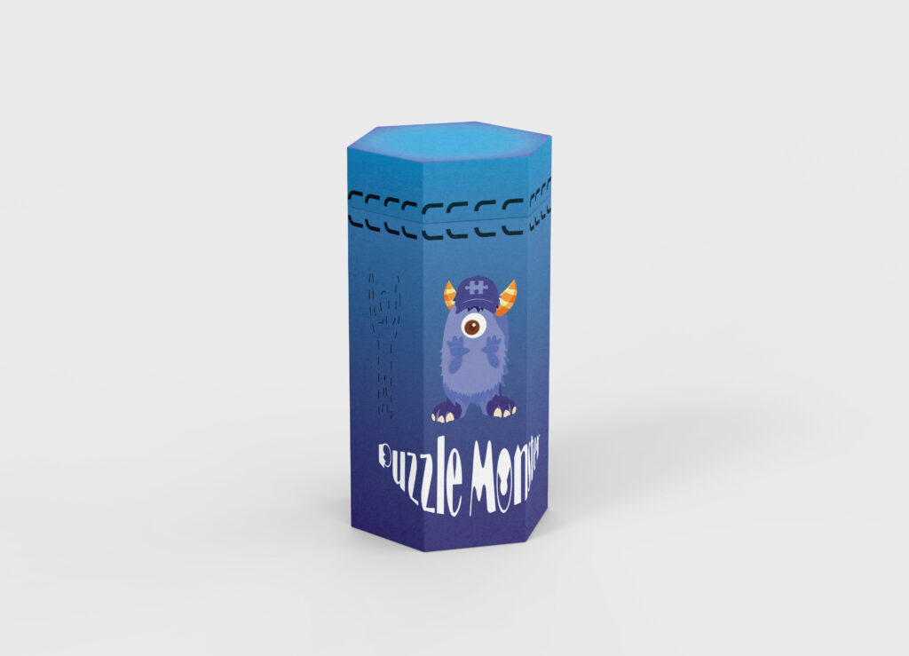
This character is blue; he is the youngest in the group, and he appreciates long walks and life in general.
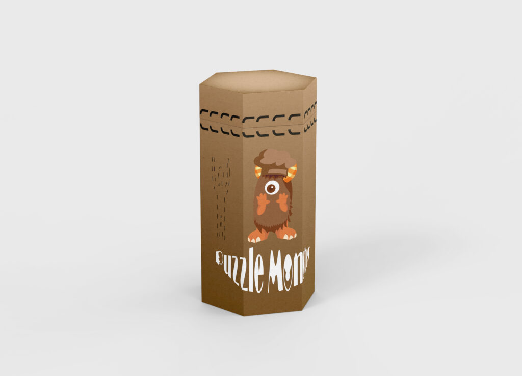
Brown is the group’s eldest and wisest member. Brown is a chef de dessert who specialises in preparing packaged sweets and enjoys indulging in some sweets.
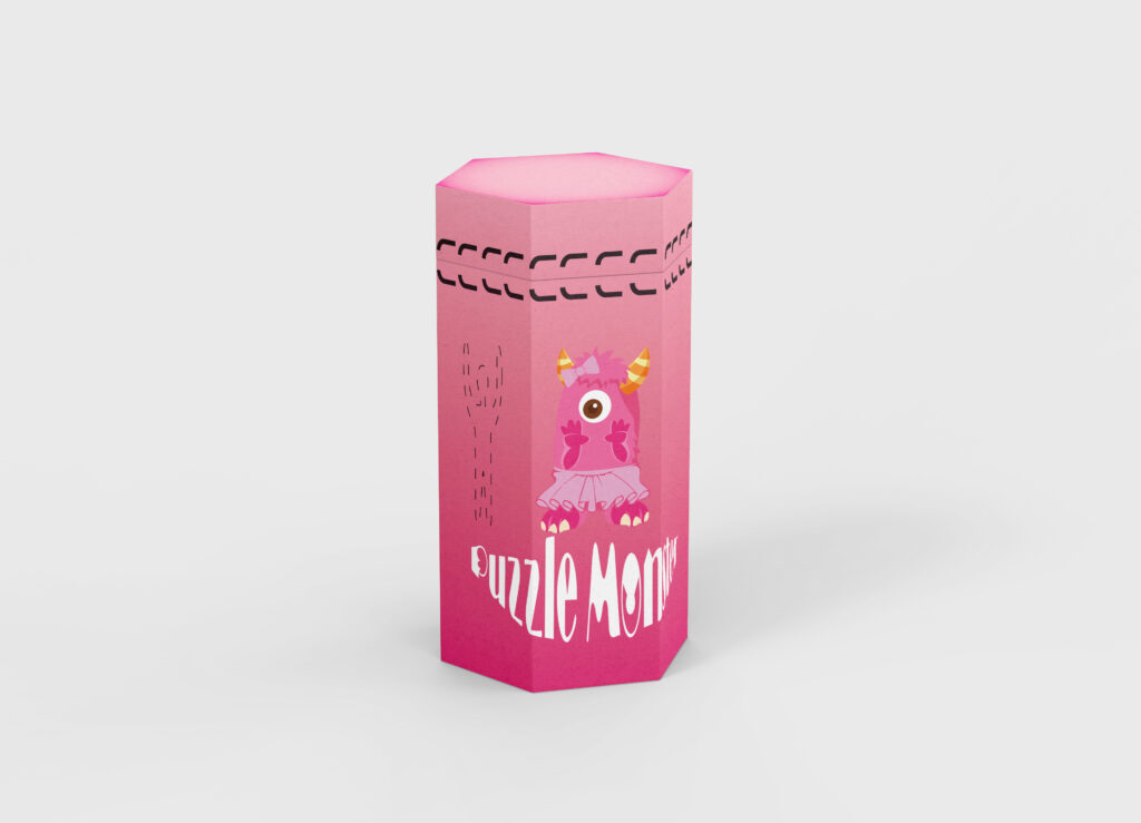
This is pink; this member is devoted to the group as if she were its princess, constantly appreciative of her ability to uplift the younger generation, and self-assured.